TopArtPrint Erfahrungen und Bewertungen
Jede Bewertung auf dieser Seite stammt von einem Kunden, der bei uns einen Kunstdruck bestellt hat, und ist mit dem gewählten Gemälde verlinkt - so sehen Sie genau, von welchem Werk die Rede ist. Unsere Kunden schreiben über das, was Sie vor einer Bestellung wissen möchten: Farben und Details des Drucks, Leinwand oder Papier, Rahmung, Verpackung und Lieferung. Wir veröffentlichen ihre Worte unverändert und in ihrer eigenen Sprache; wo wir geantwortet haben, steht unsere Antwort unter der Bewertung. Die Durchschnittsnote unten ergibt sich aus allen veröffentlichten Bewertungen.



Kundenbewertungen zu unseren Kunstdrucken

Hugo
 Verifizierter Kauf
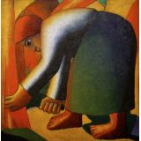
Schnitterin - Kazimir Malevich
Ausgezeichnete Druckqualität und guter Service.
Nathan
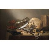
Verifizierter KaufEin Vanitas-Stillleben - Pieter Claesz
Delivered on their promises. This has always been my favorite work of art. This particular year & orientation. I was so happy your company offered it. After my ordered I was informed every step of the way. Every thing went smoothly. Packaged properly & delivered safely. Very professional I couldn’t be more happy.
Sebastian
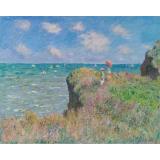
Verifizierter KaufSpaziergang über die Felsen von Pourville - Claude Monet
Sehr gute Qualität. Alles top
Ziad
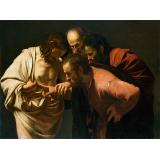
Verifizierter KaufDer ungläubige Thomas - Caravaggio
Great customer servive
Bruno
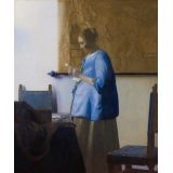
Verifizierter KaufFrau, einen Brief lesend - Vermeer
Schönes Bild, schnelle Lieferung
Enrico
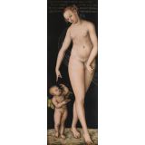
Verifizierter KaufVenus mit Cupid als dem Honigdieb - Lucas Cranach
I like the print. But to send this little package should not take that much time. Nevertheless I am very satisfied. Thanks again.
Nelli
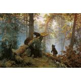
Verifizierter KaufMorgen im Kiefernwald - Ivan Shishkin
We're so happy with our print! The quality is excellent, with rich colours and sharp detail, and it looks just like the real thing. The frame is beautiful and really sets off the artwork. The service was prompt and everything arrived well packaged. We'll definitely be ordering again.
Daniel
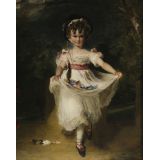
Verifizierter KaufMiss Murray - Thomas Lawrence
Magnificent and majestic. The picture is massive and looks glorious and majestic on my wall. It so clear and beautiful truly magnificent. The poster took a long time to print it felt. But soon as it was dispatched it arrived I think the next day which was incredible. Thanks so much.
Philip
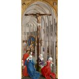
Verifizierter KaufDer Altar der Sieben Sakramente - Rogier van der Weyden
Superb, exacly what I wanted. Next step isbto have it framed.
AAE
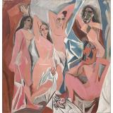
Verifizierter KaufLes Demoiselles d’Avignon - Picasso
Very happy with my first experience. Great print quality. High-quality paper. The piece looks fantastic. Can’t wait to frame this art. Thank you!
Julie
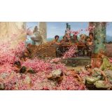
Verifizierter KaufDie Rosen des Heliogabalus - Alma-Tadema
Beautiful true colours and fine finish.
Faris
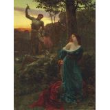
Verifizierter KaufRitterlichkeit - Frank Dicksee
Great quality and got my item quick, recommended +++
Arsen
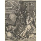
Verifizierter KaufMelencolia I - Durer
Thank you. Was good
Patrice
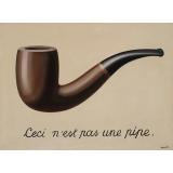
Verifizierter KaufDas ist keine Pfeife - Rene Magritte
Very happy with the quality
Miriam
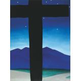
Verifizierter KaufSchwarzes Kreuz mit Sternen und Blau - O'Keeffe
Very crisp vivid colours
Barb
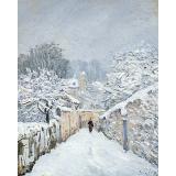
Verifizierter KaufSchnee in Louveciennes - Alfred Sisley
Beautiful print in a gorgeous frame. It looks great in my living room. Very nice quality. Thank you!
Heather
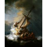
Verifizierter KaufDer Sturm auf dem See Genezareth - Rembrandt
Beautiful quality for a fair price. Dimensions were accurate.
Jane
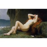
Verifizierter KaufMaria Magdalena in der Höhle - Jules Joseph Lefebvre
Perfect. I was worried that the dimensions would cut off part of the original artwork, but it is perfect. Thank you.
Emmanuel
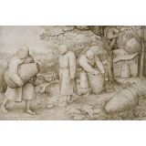
Verifizierter KaufDie Imker - Bruegel the Elder
Le cadre était très bien emballé et protégé (et heureusement parce que DHL ont transporté ça comme des cochons et le cartons était bien abîmé, malgré les indications 'FRAGILE' sur le carton), le cadre était très bien fait, et l'oeuvre (une reproduction des apiculteurs de Bruegel) très bien mise en valeur. La qualité de reproduction est excellente. Le prix de la repro seule (environ 50€) est très honnête. Le cadre (150€) sans doute un peu cher, mais de très bonne facture. Je recommande vivement topartprint si vous en avez les moyens y'a vraiment rien à redire.
Olga
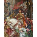
Verifizierter KaufDie zwei Kronen - Frank Dicksee
Hallo, I really liked the quality, but the frames would have been very expensive, so I ordered them without frames. Beste Grüße